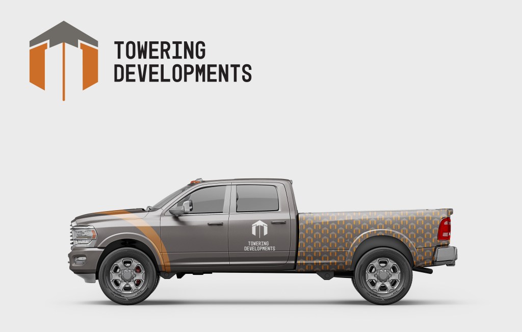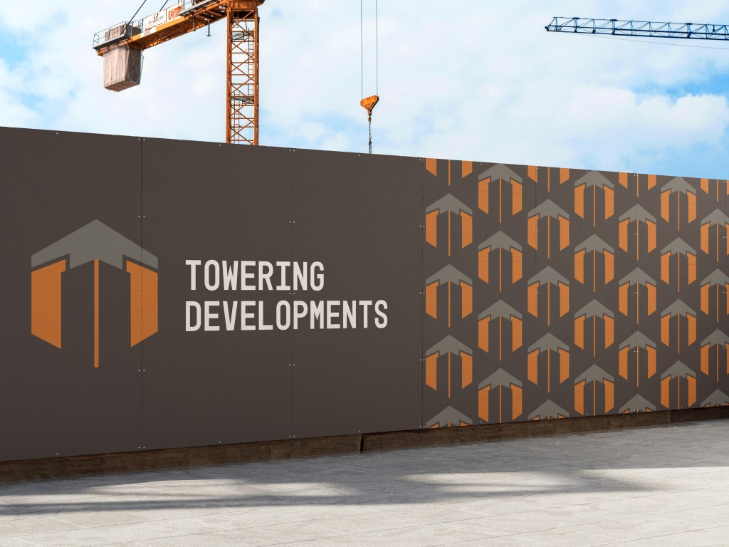
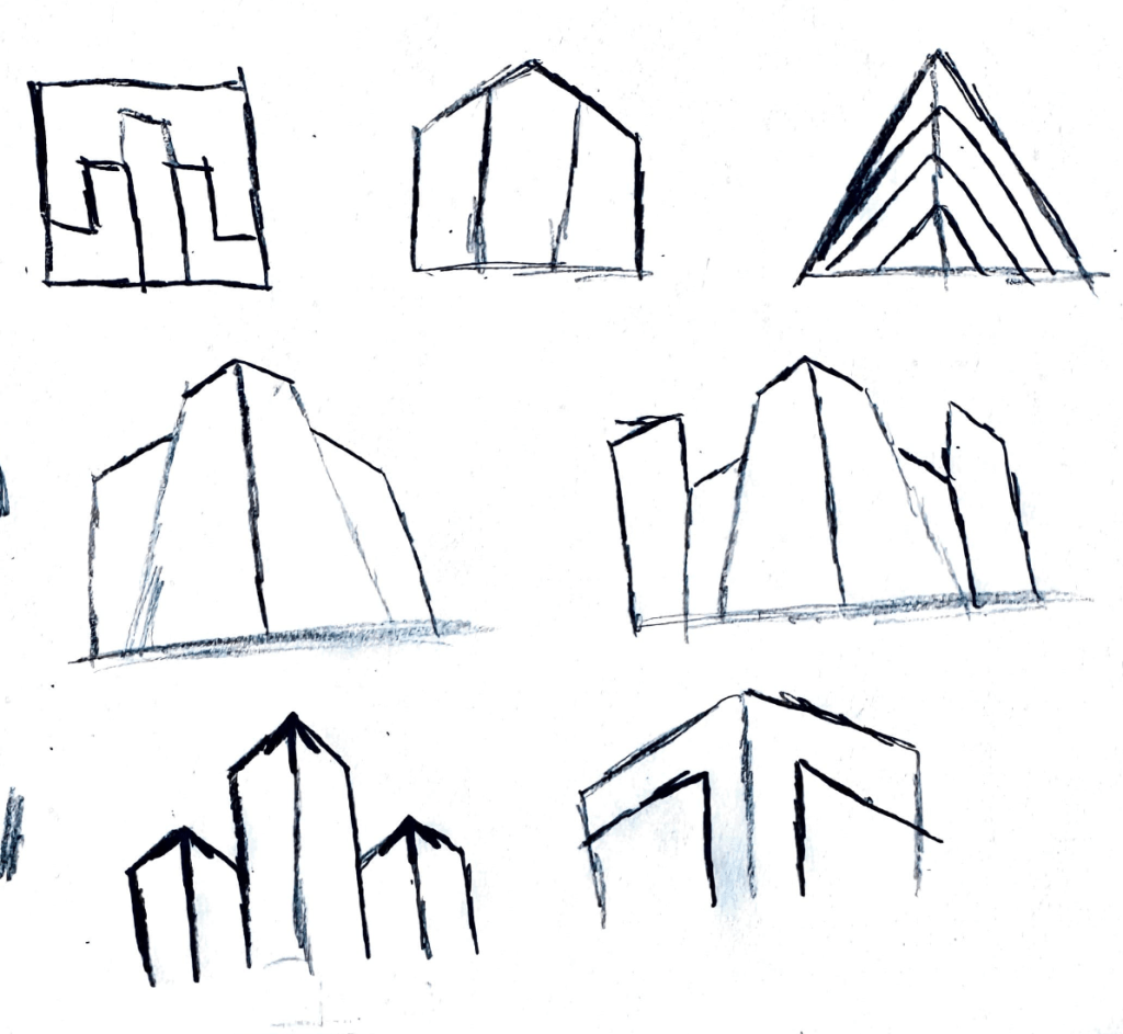
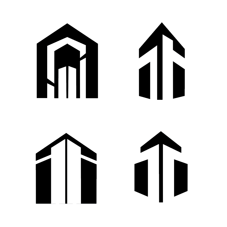
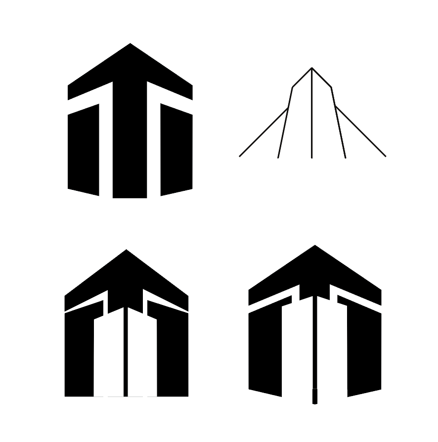
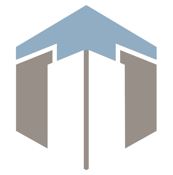
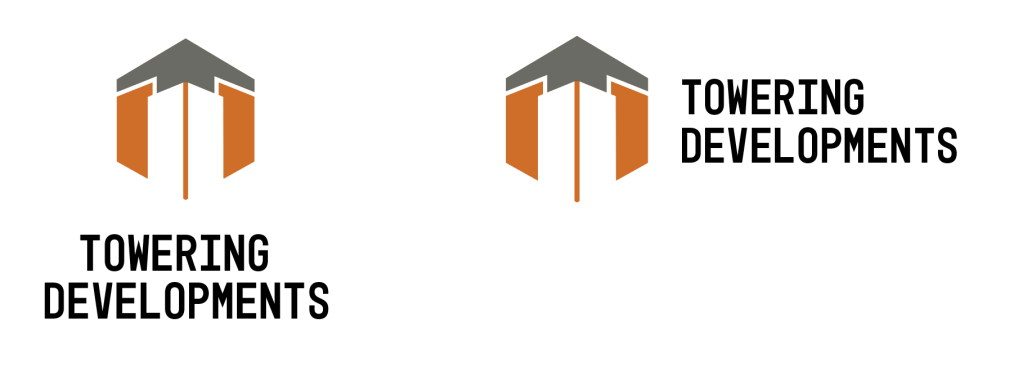
The concept for this logo was inspired by skyscrapers and the visual dominance that they represent. My initial idea was to create a logo for a commercial construction company that focuses on building high-rising structures. With that goal, I set out to create a mark that communicates dominance and growth. As I explored this idea, I incorporated sharp, geometric edges, negative space, and color to reflect these qualities. The final mark shows tall buidings with an arrow at the top symbolizing upward growth and ongoing development, which connects to the name, “Towering Developments”. The arrow also helps the buildings stand out and show the idea of buildings actively rising through the construction process. The orange and gray colors used in this logo supports the concept, as these colors are commonly associated with the construction industry through safety equipment, machinery, concrete, metal, etc. Together, the form, color, and name make the logo successful by clearly communicating dominance and growth for a company that specializes in high-rise construction.
Sketches
Digital Explorations
Color Explorations
Pattern
Final Logo
Mockups